Assumed audience: people interested in designing or building apps for tvOS.
I often joke about the HIG (Human Interface Guidelines) being an acronym for Highly Ignored Guidelines. This is an effort to change that, at least for tvOS.
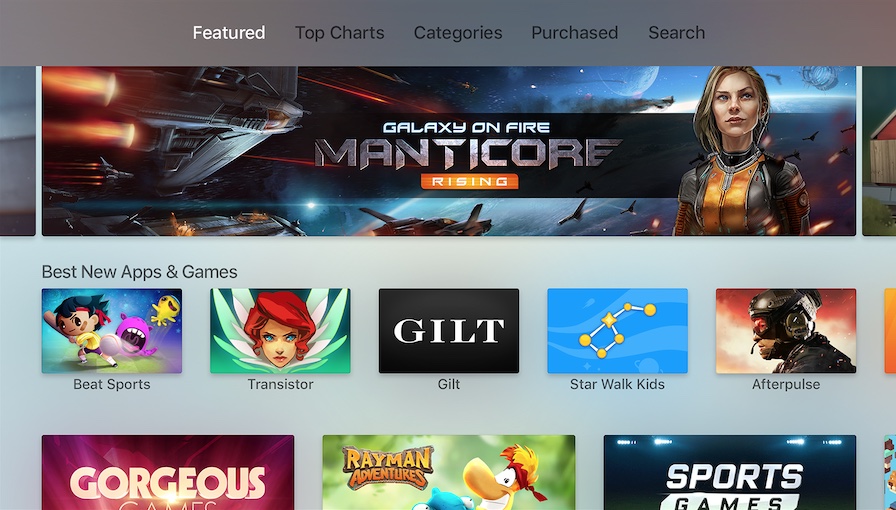
 The user interface of tvOS.
# Glossary
-
Click. One-finger quick press on the center of the touch surface. The primary way of triggering actions.
-
Click-and-hold. One-finger long press on the center of the touch surface. Used to trigger context-specific actions, like entering edit mode.
-
Focus. The state of the currently selected interface element.
-
Parallax. An effect applied to focused app icons and content elements using multiple layered images.
-
Siri Remote. The Siri-enabled remote used as the primary input method for Apple TV. It comes with 6 buttons, a touch surface, an accelerometer, and a gyroscope.
-
Swipe. One-finger press followed by a quick movement in any direction on the touch surface. Used to move focus vertically or horizontally.
-
Tap. One-finger quick press on one of the four directions (top, right, bottom, left) of the touch surface. Used for single-item directional navigation.
-
Top Shelf. The area above the first row of apps where featured content of the focused app appears.
Update: My colleague Jack Nutting pointed out that clicks require you to press the touch surface until it clicks, whereas taps don’t.
# General
- Design with multiple simultaneous users in mind.
- Prefer showing old data to no data at all.
- Avoid excessive animation.
- Avoid using alerts unless it’s for a critical user decision. When you do, provide no more than two choices.
- Don’t display your logo throughout the app UI.
- Use the system video player to get advantage of all its interactive features.
# Focus
- Make focus obvious using labels, transforms, and other effects.
- Use parallax on focused elements to make the UI more responsive to user interaction.
- Prefer light backgrounds so that focus shadows remain visible.
# Controls
- Keep the difference between click and tap in mind. See the glossary.
- Avoid using taps for triggering actions other than navigation.
- Avoid using standard gestures to perform non-standard actions.
- Avoid defining new gestures to perform standard actions.
- Make sure your controller-compatible game works with the remote as well.
- Always enable the Play/Pause button on the Siri Remote. If you are running out of ideas, make it at least perform a click.
- Use gestures to move focus, not content. For instance, a left swipe would move focus to the left, making the content move to the right.
- Use gestures to move content when displayed full-screen. For instance. a left swipe on a full-screen image would move the image to the left.
# Navigation
- Use the tab bar for the main navigation of your app.
- Allow your users to navigate back to the previous screen or out of your app/game using the Menu button.
- Don’t display a back button.
- Keep your content structure simple for easier navigation.
- Prefer text, more specifically nouns and verbs for your tab titles.
# Visual Design
- Design your interface for a 1920 x 1080 pixels (16:9) screen in mind.
- Use @1x resolution for all image assets.
- Use an opaque background layer when making your layered images.
- Provide at least one static Top Shelf image (1920px by 720px) if you don’t have any dynamic content to showcase.
- Use the sRGB color space.
- Favor muted color for better results on highly saturated TVs.
- Prefer top-to-bottom, light-to-dark gradients.
- Prefer horizontal layouts.
- Leave 60 pixels on the top and bottom, and 90 pixels on the right and left as padding around the edges of the screen.
# Text
- Use San Francisco Text for text 39 points or smaller, and San Francisco Display for text that’s 40 points or larger.
- Put text in the top-most layer of your layered images.
- Use the built-in text styles to take advantage of features like Dynamic Type.
- Use title-case in your text buttons.
- Avoid combining both icons and text in buttons.
- Try to limit text-input in your app since typing on the Apple TV can be tedious.
# App Icon
- Use a layered image (2-5 layers) for your app icon (1280px by 768px for large version and 400px by 240px for the small one).
- Leave a padding around the content of your foreground layers.
- Don’t include screenshots in your app icon.
- Avoid text in your app icon, unless it’s part of the brand.
Found any typos? Edit the post here.
